Design system
Refactoring Ubity web portal UI
Company
Ubity
Duration
8 months
Year
2019
The brief
Ubity is a company providing telephony solutions to small and medium-sized enterprises and currently one of the top 10 players in Canada. Since the creation of the company in 2007, Ubity offers a self-service web portal called Studio to help clients manage their phone system.
However, for over 10 years, several developers and designers succeeded each other working on Studio, all with their way of coding and designing. User interface inconsistencies became more and more apparent to the end-users and a lot of frustrations began to emerge, leading to friction within our team. We needed to address these issues and become more efficient in the way we were building our front-end user interface.
In July 2019, Ubity has been acquired by Telus, one of the three largest telecom providers in Canada.
My role
- Co-initiator of the refactoring
- User interface design (UI)
Team
- Victor Bruzeau (UX/UI designer)
- Cédric Thivolle (Developer)
Research
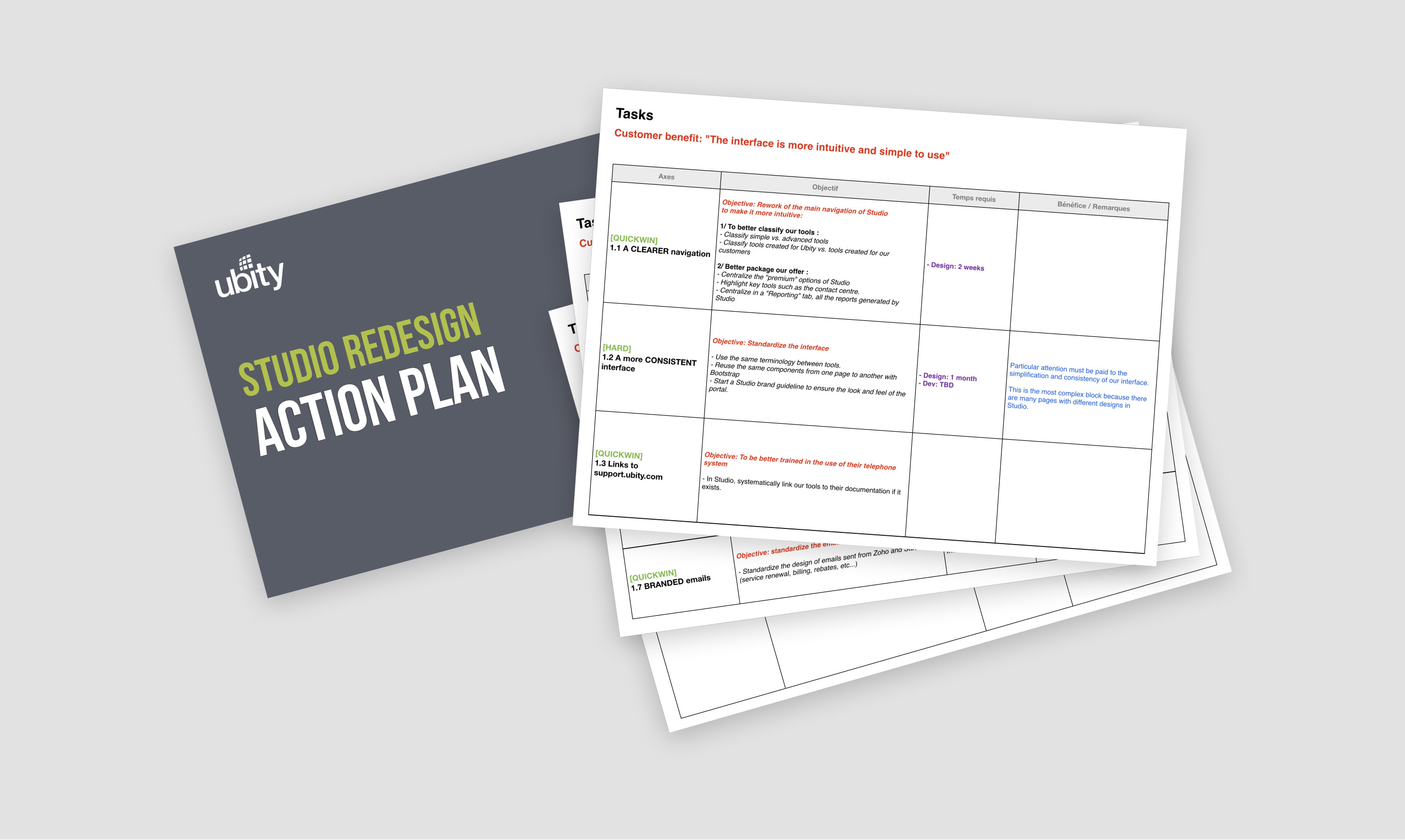
Planning the refactoring
Large companies often have dedicated teams working on the refactoring of their interfaces. Being one half of a two-man team working part-time on this project, our first task was to create an action plan that we could realistically achieve.
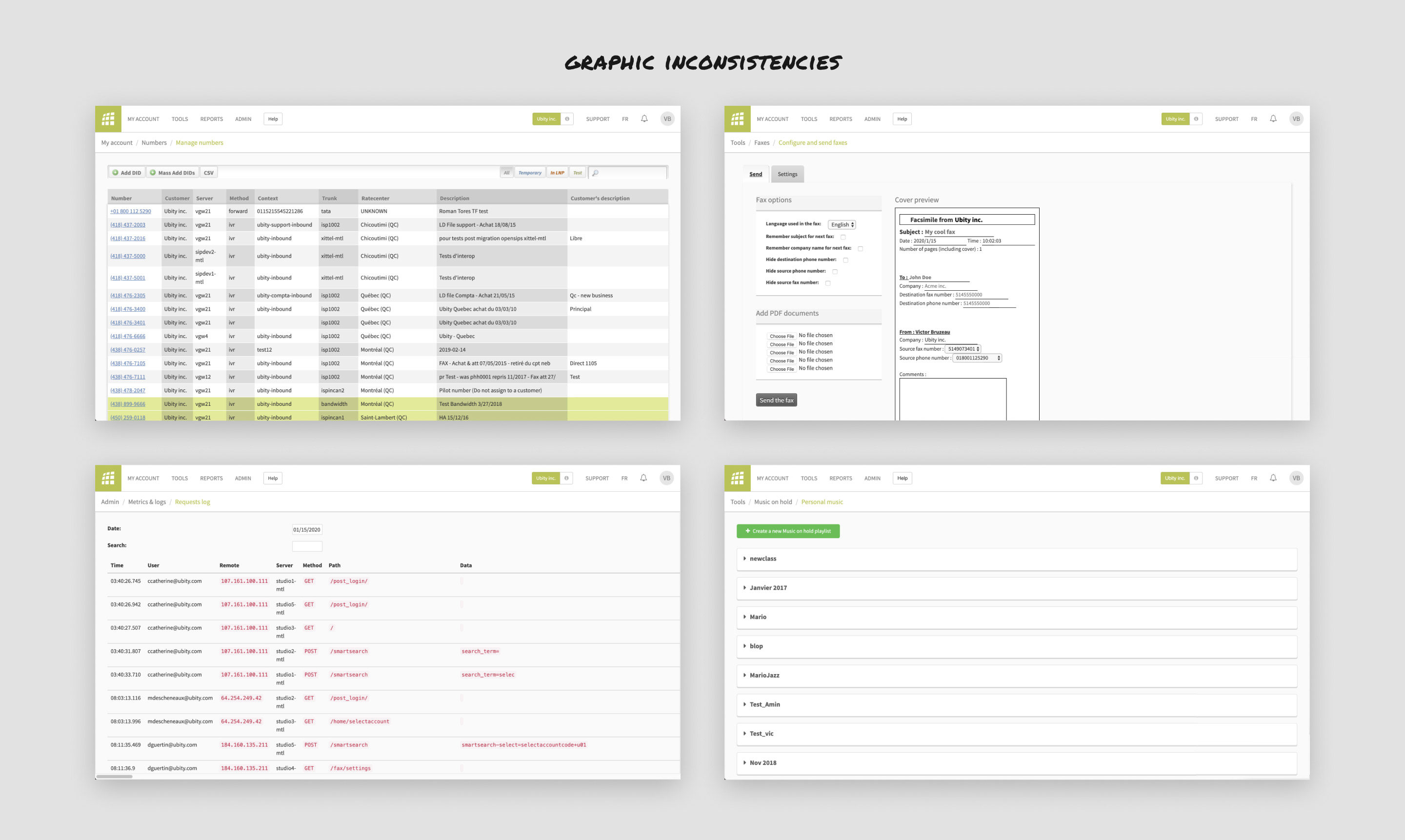
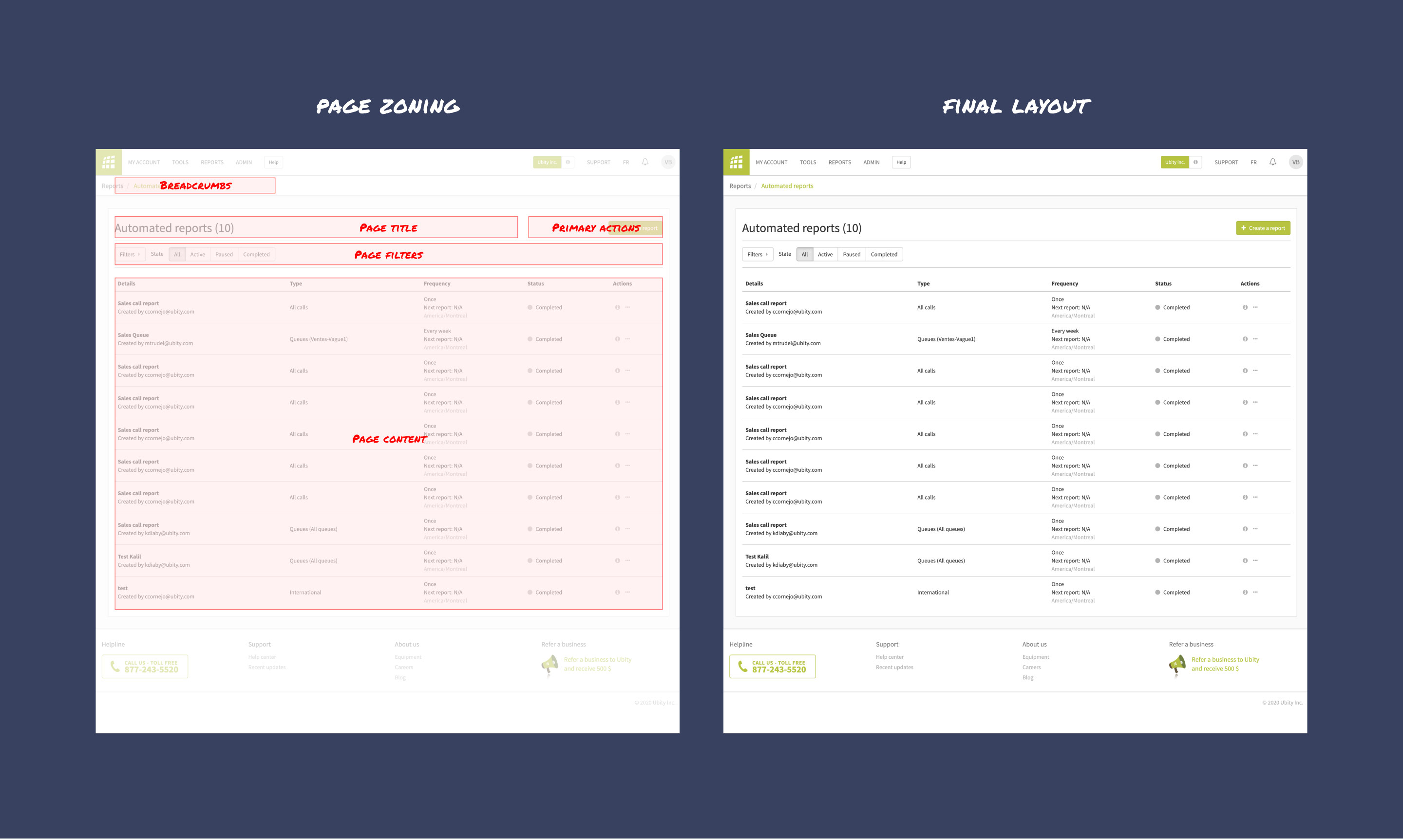
UI assessment
Putting the plan into action, I started to make an inventory of the various layouts and UI components used across the interface. The goal was to find recurring patterns of components we could reuse as well as spot major layout inconsistencies.
Challenges
1. Convince the management: we needed to showcase the benefits this project would bring the team while guaranteeing that we could tackle it alongside other projects planned in the roadmap.
2. Develop a white-label ready interface: several Ubity business partners were using the web portal as a white-label platform. Our solution needed to be easily customizable and maintainable.
3. Develop best practices: this project could only be successful if widely used by the development team. How could we make sure designers and developers would adopt our guidelines and contribute to it?
Solution
A framework-based redesign
Upon completion of the initial UI assessment, rather than recreate our interface from scratch, we decided to use Bootstrap, a popular front-end framework, as the basis of our new UI.
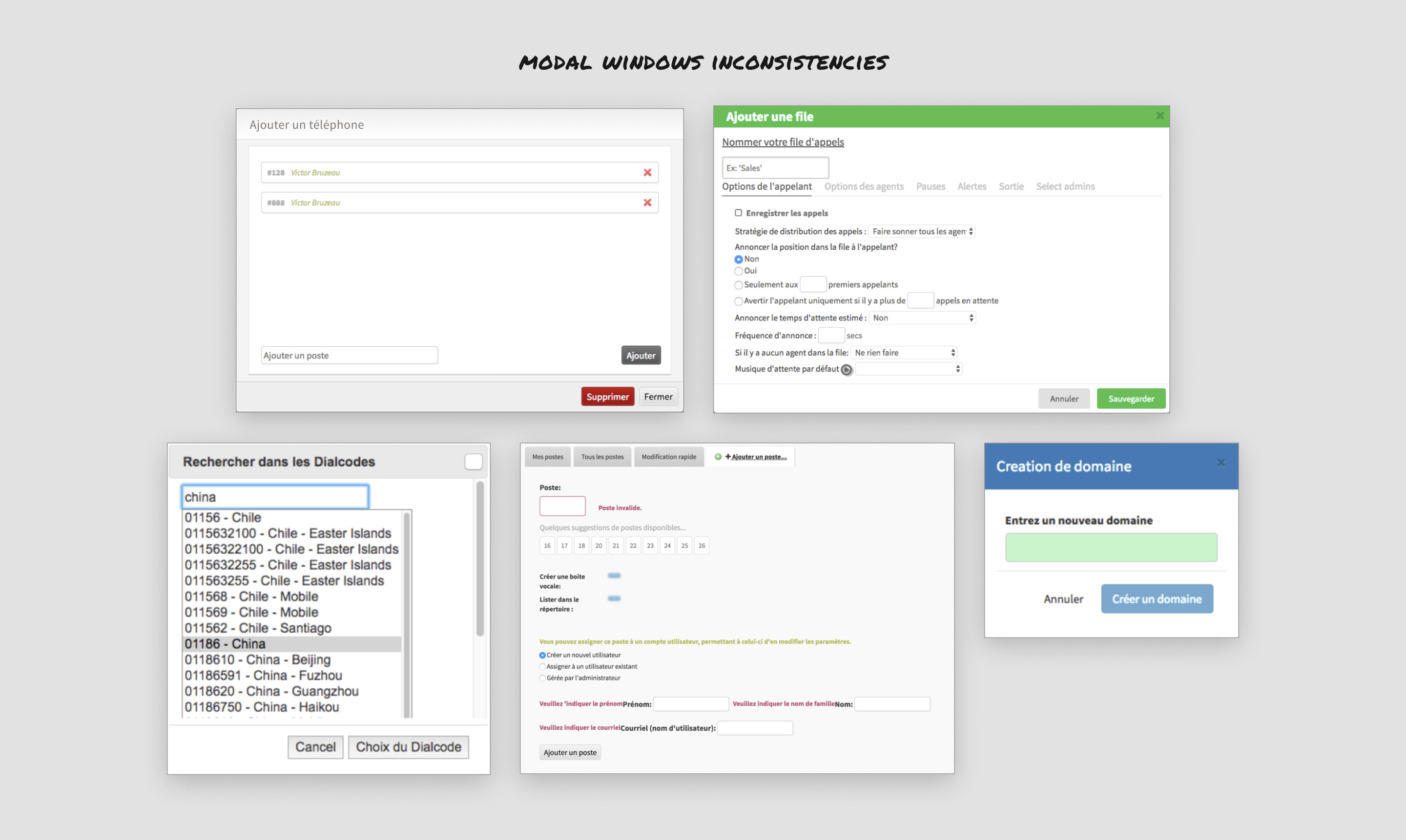
Each component found in the existing interface was refactored according to Bootstrap and our design guidelines. The video below is an extract of the documentation presenting the refactoring of 70+ modals windows.
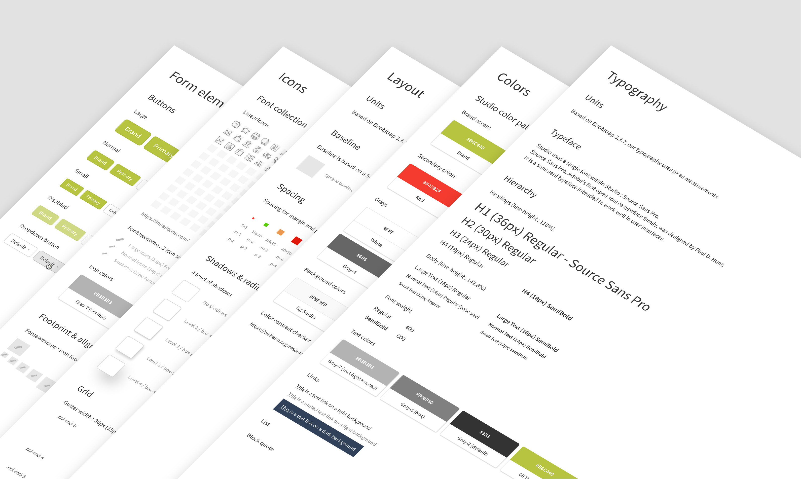
Once refactored, each component of the new UI was then meticulously cataloged in an inventory.
We also rebuilt our main page layout so it would incorporate all the UI elements we needed for our interface.
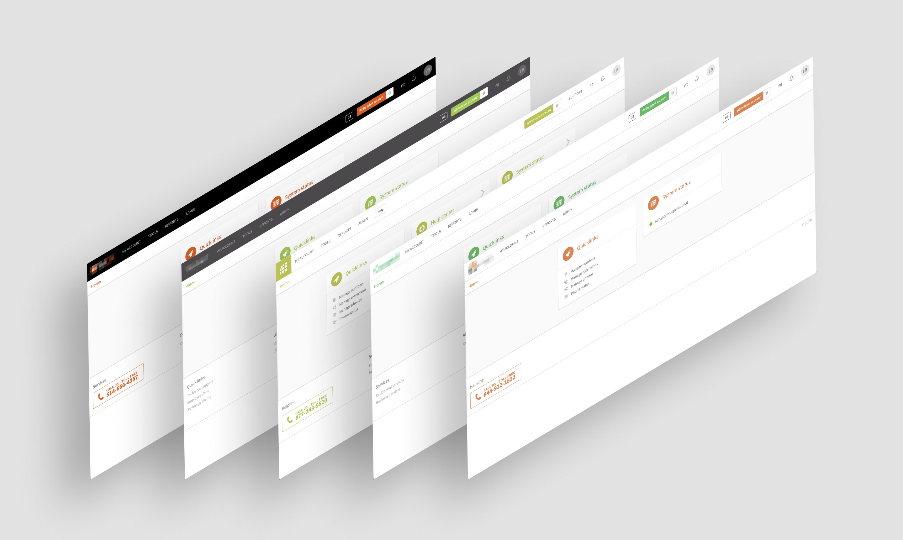
A white-label ready interface
Our new interface was also developed to be quickly customized to match the branding of white label partners.
Evangelizing the design system
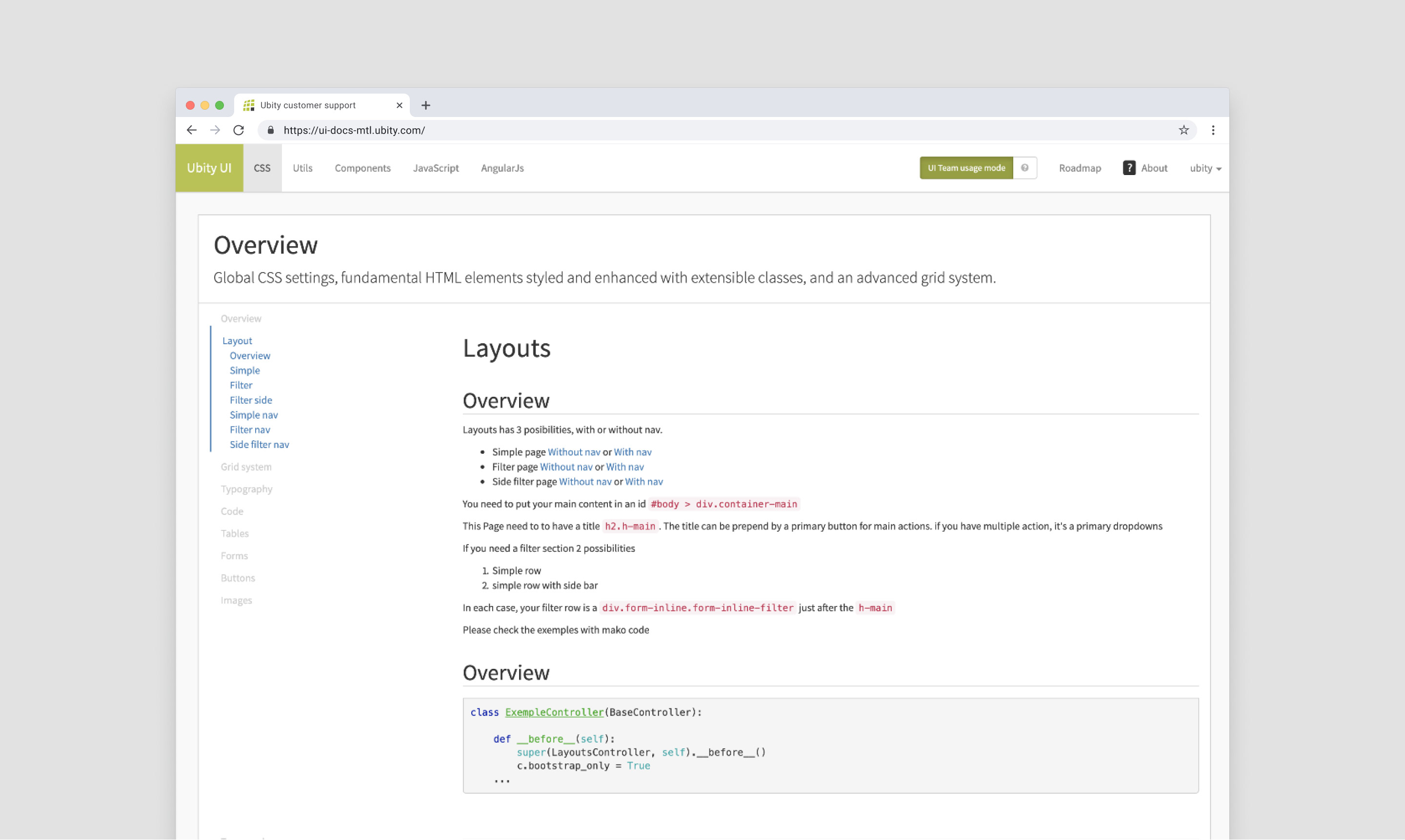
Once the new design system was validated by the team, we wanted to make sure other developers and designers would use it regularly. As a result, we made these guidelines accessible by building a documentation website and a user interface library.
Adopting best practices
Finally, to limit further inconsistencies, we introduced a methodology where any new UI elements not documented in our library would have to be reviewed by the team before being implemented.
This approach greatly improved the consistency of our interface (and our sanity).
Conclusion
Since the beginning of the implementation, our new design system has been a complete success and one of the works I'm the proudest of. Besides bringing consistency across the whole interface, the benefits it brought were manifold:
- This project helped shift the developer/designer conversation away from minor cosmetics inconsistencies to concentrate on the most important one: improving the overall user experience.
- Our documentation website helped developers ship new features faster as we greatly reduced the time spent on code review.
- The design library greatly improved how quickly we could design and iterate ideas.
Lessons learned
- One mistake we initially made was to let our development team use Bootstrap without creating design guidelines. Lots of inconsistency started to emerge as choosing a framework does not mean having a design system in place!
- Frequent collaboration between designers and developers is the most crucial part behind creating a truly functional design language. It is also a unique opportunity as a team to strengthen bonds between employees.